4 Best Website Design Layouts for an Ecommerce Business
- April 27, 2017
-
365admin2015
- E-Commerce
 A website acts as a bridge between the potential customers and an organization. How good or how easily can a person reach the destination depend on that bridge. The bridge may have a simple structure, but a complex appearance may stop people from using it.
And, if you are planning for a good Return on Investment from your Ecommerce business, then address the design issues appropriately. The success of an online business depends on two factors, a tastefully designed and beautifully structured website.
Nowadays, it is really difficult to appeal the internet users, but seriously, you do not have to think ahead of your time to achieve that. To stop the eyeballs from seeking information from other sources your website should be exceptionally good in terms of appearance and functionality.
How well has been your website’s layout chosen? Is it messy, professional or a better word, is it relevant? Yes, every visitor looks for that and quickly seals the fate of that website. Most of the time relevancy becomes the cause for bounce rates. A good navigation defines a well-defined layout, where people can easily explore the website without getting lost among the myriad of categories.
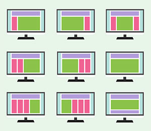
Web layout patterns should represent the UI aspects well enough to retain the interests of potential customers. In the following section, I have explained about some of the best web layout patterns.
Exploring, the 4 Website Design Layouts
- Cards-
- You have a truckload of content to display, will you take the risk of piling your web page with the same? Do you have any other option? Yes, card design layout is here to your rescue. Not only it gives you a professional option but also supports your every idea with enough space.
- Facebook, Twitter and Google Plus, are the most popular examples adopting this UI layout. The best part about this design layout is the responsiveness. Yes, it fits all the screen sizes without any setback.
- ‘Play your cards right’ by going with the card layout for your website designing. So what is a card design layout? Aye, we got to this point at last.
- “A simple rectangular box with a gist of information and interactive images that expand when clicked, swiped, or tapped”.
- Grids-
- Heavy content websites are always a threat to the customer’s interests. Not only have they affected the page loading speed, but also the overall appearance. Currently, a 12-column grid layout is in practice.
- As an expert web designer one gets to have a commanding control over the clarity and efficiency of a layout. Also, layout issues are best addressed in a grid system.
- Grid-layout designs promote user-friendly interface, from desktop to Smartphones, the websites built under this layout promotes a clean and simple look.
- Magazine-
- Usually, if you come across any online news portals or blog based websites, you may see the magazine design layouts in use. The main element of this layout is images. Yes, images are the heroes and you can come across a series of horizontal and vertical menus.
- A good website design is all about better organization and flexible information accessibility. Is your website providing that? If not, go with this design layout and achieve the same.
- Container-Free-
- You have to literally sacrifice the idea of adding any kind of visual elements if you go with this layout. Why? Because the container-free design is all about colors and fonts and hence there is no room for graphics. Fair enough no, with all due respect let us give typography some prominence and see the results.
- Web designing is not always about bejeweling a web page, as sometimes it should also define simplicity.
Outsourced365 Services are designed to help you grow
Contact us Today!
Why Companies Build Websites with Outsourced365
With our web design services, you will get:
- Modern, conversion-focused layouts
- Responsive design across all devices
- Optimized user experience and navigation
- Scalable websites built for growth

Related Posts
See all posts