![]()
A logo is a graphical symbol, combination of text and visual imagery designed to represent a person or an organization. Altogether, the purpose of a logo is branding.
Some of the successful logo designs have these characteristics in common; they would be simple, but eye-catching, easily memorable, trustable, flexible, and consistent.
The well-known brand Nike has a simple swoosh for its logo. But not all the logo design is restricted to either plane symbols or text; it can be a combination of both. Starbucks, Heineken, both have the most complex logo design and is inclusive of text as well as design.
Having a fanciful or complex logo design will not always work. And fortunately, there are trends to be followed if you are to create the most successful logo.
In this blog post, you will learn about 5 popular logo design trends that will dominate 2018. So keep your eyes open, if you want to stand out in the so-called dominating digital market by following these trends.
Logo Trends to follow in 2018
- Use Simple & Basic Shapes
- "Simplicity is the ultimate sophistication." - Leonardo da Vinci
- Simple shapes, what do you picture in your mind when you hear the word simple shapes?
- A circle, a triangle, a rectangle, an eclipse, or a star?
- International Olympic Committee has not used athletes or any form of the game as their logo. Apple is not represented by a computer or iPad and nor Nike has used shoes in its logo. All of these brands are the most recognized in the world having the most simple logo designs.
- Every symbol carries certain connotation, for instance, a triangle represents direction or tension, a circle is infinite or protective, a square, on the other hand, is solid and stable.
- Your logo design can be based on a single shape or the combination of multiple shapes, but whatever may be the final design unless it conveys the right message it will not carry its weight for long.
- If you are graphic designer understanding the psychology of shape should be your priority, also while you do that learn about business goals and requisites. Only then you can overlay the purpose and ideas together through a good logo design.
- Simple logo designs are back in trend again, so be with the trend.
- Letter Stacking
- Letter sacking is one of the new trends; yes, stacked typed logos are quite catching up with the brands. In this design approach, the words are piled on top of each other, but the design looks more appealing if contrasting colors are used.
- Now, letter stacking technique might be new but has already managed to grab attention and is quite popular among graphic designers.
- Again its common sense, letter stacking will work better for those brands with lengthier names.
- Go back to Coat of Arms
- TERRAZA DE REYES, RASPBERRY GARDEN, MACKLEBERG COSMETICS, PELICAN BEACH - are some of those brands that successfully replicated coats of arms.
- If you analyze these logos, the text/words are positioned inside semicircle or circle, or the text itself is arranged in the form to get that ancient, primeval appearance.
- Basically, coat of arms is a heraldic visual design on a shield. (Wikipedia)
- A stamp like a logo with a retro shade, coat of arms is a perfect trend to connect with the audience.
- Gradients & Color Transitions still in Vogue
- Don’t you feel every solid plain color is taken away by big brands? If you feel stripped of options try using gradients.
- Now, how did you feel when you saw Instagram’s new gradient logo?
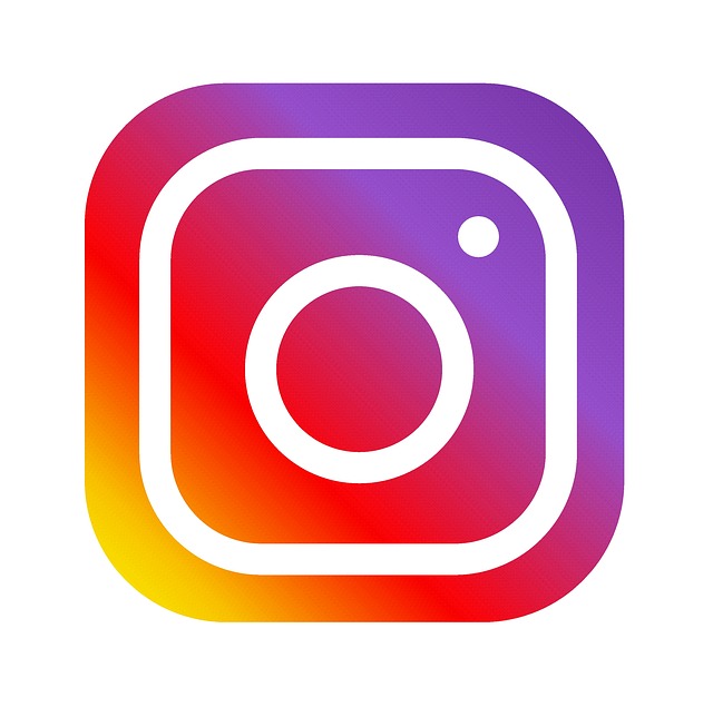
- Is it not refreshing? I felt the graphic designer who designed it truly did justice understanding the color scheme. It’s common to find people going with flat colors because they are safe and easy to play with. On the other hand, gradients work because they are unique, memorable, realistic, fun, and are a festival to the eyes.
- Explore Typography More
- The logo for MailChimp, the popular email newsletter platform was created by Jessica Hische. The beautiful handwritten logo she has created is quite popular.
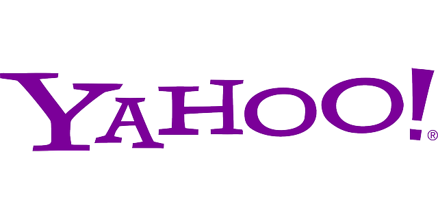
- The logo of Apple is sans any words or letter. That doesn’t make any statement or forecast that you should follow the same. Again take the example of MailChimp or Yahoo; they are not playing with any shapes or designs. Till now, you might have seen people working on color psychology, now it’s time we focus on typography psychology.
- Choosing the right font might seem easy, but it’s not. You have to understand how different typefaces invoke emotions as similar to a color before using them for your logo.
Contact us
Contact us to discuss your web design related requirement. Get in touch with us by sending a message through our contact form and we will reply back ASAP. We can discuss how we can strategically offer web design services for your organization.
Outsourced365 Services are designed to help you grow
Contact us Today!
Why Companies Build Websites with Outsourced365
With our web design services, you will get:
- Modern, conversion-focused layouts
- Responsive design across all devices
- Optimized user experience and navigation
- Scalable websites built for growth

Related Posts
See all posts