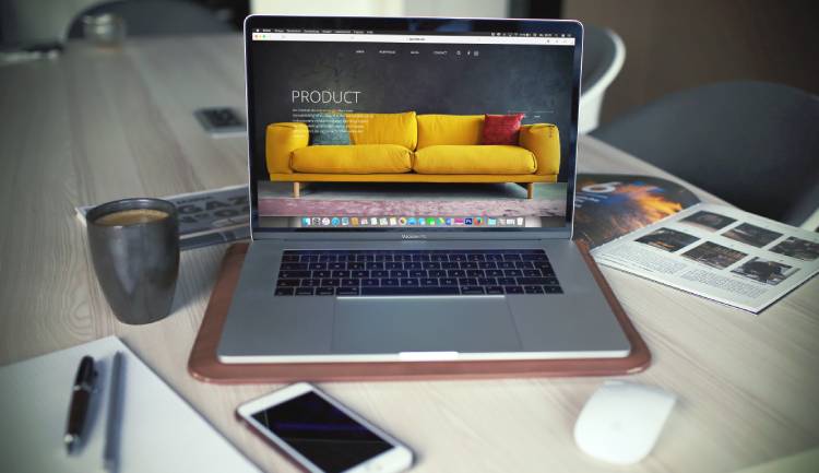
 What’s new in 2018? Website designs constantly evolve. A design, an idea that was in vogue yesterday, today is obsolete. Behind that simple, clear, user-friendly websites, designers have to work on a lot of elements including website structure, information architecture, layout, colors, navigation ergonomics, and much more.
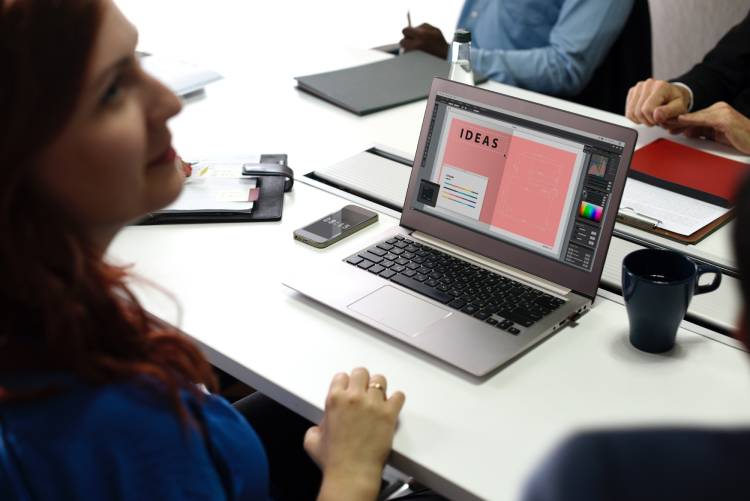
Apart from these, web designers as they have been doing every year, have to keep up with the changing trends. 2017 was an exciting one, and now it’s time we know what’s in store for the New Year. Since we have already stepped in, let’s not waste time but learn about new web design trends that will rule our interests for the next 12 months.
Web Design Trends to Watch in 2018
- The Rise of BRUTALISM Continues
Tidy, professional looking websites are losing shine to the ugly design trend, which is referred as brutalism.
The brutal web design is hard to describe, you find the appearance nowhere similar to features that you find on conventional websites. The distinct lack of hierarchy, nonconformist visuals/unordered images, and the worst there is no word about UX, the raw concrete appears will definitely keep you hooked for a longer time.
Can anyone just adopt this untidy pattern for their website? No safe web colors or the beautifying component to call the roaming eyes.
It’s an obvious question because every trend is not for everyone. But I can only give you an example.
Bloomberg, if this brand can successfully pull-off brutalism design concept, I’m sure any brand will manage with all grace. The web design may be harsh on the face, but our modern day webmasters must adopt this style for the new generation.
- Use more ASYMMETRICAL Pattern
I feel 2018 is completely uneven; people are readily going against the conventional graceful appearance.
When do we say a picture is symmetrical?
Only when the two mirrored sides are exactly the same and the best example is a butterfly, it defines a pure symmetry for the human eye.
On a website, if we have a central axis or a point, and the elements are distributed evenly on the page, it defines symmetrically designed website. Now, the trend has changed and it’s a straight asymmetrical without a wave of symmetry. People are finding the word ‘symmetry’ boring and stagnant; they want something dynamic, something that does not look too balanced.
In a single word answer, it’s ‘asymmetrical design’.
Asymmetrical website designs may sometimes cause confusion to the eye, but they are definitely interesting and aesthetically pleasing.
Also, it’s not hard, but web designers have to use grid layout smartly to balance between asymmetrical elements. Using column grid with an odd number of columns will do the trick.
‘Moresoda’ is a perfect example to be successful in pulling-off the asymmetrical design concept. The website features a large image and block of text, where both the components are perfectly tuning with each other.
- Give prominence to VOICE & NATURAL Language Search
The search bar is one of the prominent elements of a website; users easily reach the desired product with less number of clicks.
Web designers know exactly how a search bar can impact the sales rate of a website. More number of clicks towards the destination means customers would jump to another website. Clearly, the search bar was a one-way tunnel towards the destination, but lately, things have progressed a lot. Artificial intelligence, machine learning, the more its complex for the designers and developers, easier it is for the end-users.
Designers should not delay this anymore, the sooner the better and it’s not something to analyze whether the feature will work or it. They should start optimizing their websites for the natural search language.
The best example is the Google search engine; you might have seen there is a small icon like a microphone. Use it today if you have not done so,
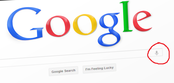
According to the study by Location World, 40% of adults now use voice search once per day. It’s time your websites leave traditional web search practices and switch over to voice search and personal assistants.
- Opt for VIBRANT, SATURATED Color Schemes
Soothing colors are safe, but they are only a handful of numbers. The new generation is looking for something vibrant, daring colors that would leave them awestruck.
Colors used on a website can impact user’s perceptions, emotions, and even the action they take, the visit duration, click rates, and sales.
Most of the web designers are stuck with traditional or web safe colors, but if you want your brand to stand out try rich colors from the color wheel.
Colors are the powerful visible tools that can be used to your advantage and improve user engagement with the websites.
- Go for Bottom STICKY Elements
Whether it is a mobile application or website, sticky navigation elements represent visible cue for users on the visit. A customer/visitor using the website can easily find his way to the information he wants to access or even back to the homepage.
Long-scroll websites or mobile websites with bottom sticky elements enhance user-experience. People, today prefer SmartPhones over a desktop, because they get to be mobile with convenience. Now, if you observe the area where they hold a mobile device is referred as thumb zone. Having sticky elements at the bottom near the thumb zone makes it easier for the users to take the desired action.
If you are going to implement sticky navigation on your site, explore the experience as a customer and provide the best user-centric solution.
Contact us
Contact us to discuss your web design related requirement. Get in touch with us by sending a message through our contact form and we will reply back ASAP. We can discuss how we can strategically offer web design services for your organization.
Outsourced365 Services are designed to help you grow
Contact us Today!
Why Companies Build Websites with Outsourced365
With our web design services, you will get:
- Modern, conversion-focused layouts
- Responsive design across all devices
- Optimized user experience and navigation
- Scalable websites built for growth

Related Posts
See all posts