What Customers Notice About Your Website in the First 10 Seconds (And What It Costs You)
- July 3, 2026
-
365admin2015
- Outsourcing

Ten seconds. That’s roughly how long you have before a visitor decides whether to stay or leave. It’s not a generous window—and most of it passes before anyone reads a single line of copy.
The frustrating part is that businesses spend significant budgets on outsourcing digital marketing services attracting visitors through SEO, ads, and social content—then lose them in moments that happen too fast to see in a standard analytics report. A slow page, a confusing layout, an outdated design, a missing trust signal: any one of these can end a visit before it starts.
The good news is that those first seconds are not random. Visitors process specific things in a predictable order. Understanding that sequence lets you fix what matters most—and stop losing people who were already interested enough to click.
Here is what actually happens in those ten seconds, in roughly the order it happens.
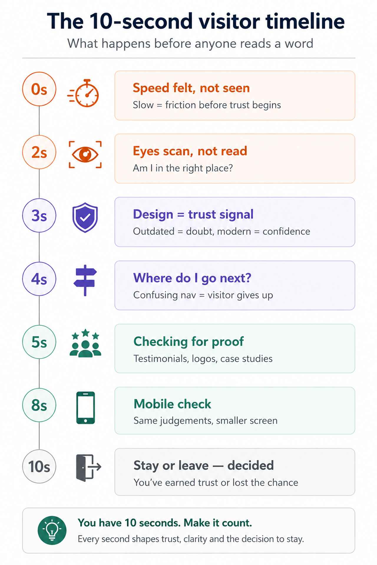
Second 0–2: They feel the speed before they see anything
The first experience of your website is not visual—it’s temporal. Before a visitor can read your headline, view your logo, or assess your design, they’ve already felt whether the page loaded fast or slow.
A delay of even a second or two registers as friction. It doesn’t matter how compelling the content behind it is—slow loading signals something about your business before you’ve said a word. On mobile, where most people now browse, the tolerance for this is even lower.
Google’s Core Web Vitals framework measures loading speed, input responsiveness, and visual stability as direct indicators of user experience. Poor scores don’t just affect how visitors feel—they directly affect your search rankings, meaning slow sites attract fewer visitors and convert the ones they do attract at a lower rate.
What to fix: Run your site through Google PageSpeed Insights. Target a mobile score above 70 and address any Largest Contentful Paint issues—this is the metric most directly tied to the perception of speed.
Seconds 2–4: They scan for relevance
Once the page loads, the visitor’s eyes do something specific: they scan. Not read—scan. Research on web reading behaviour consistently shows that users move in an F-shaped or Z-shaped pattern, hitting headlines, subheadings, and images first.
During those first scanned seconds, they’re answering one question above all others: am I in the right place? Every visitor arrives with something in mind—a problem to solve, a service to evaluate, a comparison to make. If your homepage doesn’t answer that question within two or three seconds of scanning, many will leave rather than dig deeper.
The failure mode here is subtle. Most business homepages say what a company does but not who it’s for. “Full-service digital agency” tells a visitor what you are. “We help mid-size retailers sell more online” tells them whether they should stay.
What to fix: Read your homepage headline as a first-time visitor. Does it tell someone—within five words—whether they are the right customer for your business? If not, that’s the single highest-impact copy change you can make.
Seconds 3–5: Design tells them whether to trust you
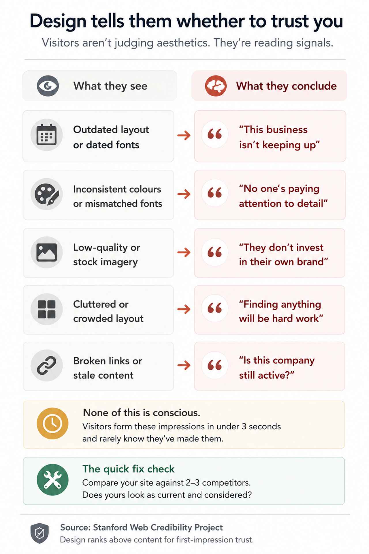
Design credibility is one of the most discussed—and most misunderstood—aspects of website performance. Businesses often frame it as aesthetics. Visitors experience it as a credibility signal.
Research from Stanford’s Web Credibility Project found that website design is one of the most influential factors in how users assess a business’s trustworthiness—ranking above content quality in many cases. Visitors aren’t consciously evaluating your colour palette or typography. They’re making fast, intuitive judgements: does this look like a real, established business, or does it look neglected?
Outdated layouts, inconsistent fonts, low-quality imagery, misaligned elements, and clashing colours all register as signals of neglect—even to visitors who couldn’t articulate why. The result is a quiet reduction in confidence that often goes unmeasured because visitors simply leave without saying anything.
What to fix: Compare your website against two or three direct competitors. Does yours look as current, as considered, as professional? If it doesn’t hold up, that gap is active damage to your conversion rate.
Seconds 4–6: They look for a route through
A visitor who likes what they’ve seen so far faces their next decision: where do I go from here? This is where navigation either supports the journey or ends it.
Research from the Nielsen Norman Group suggests that users typically spend only a limited amount of time evaluating web pages and prefer interfaces that reduce cognitive effort through familiar navigation patterns and clear information architecture.
The most common navigation mistake is designing it around how a business thinks about itself—its departments, its service categories, its internal structure—rather than around the questions a customer is trying to answer. A visitor looking for pricing shouldn’t have to open three menus to find it.
What to fix: Ask three people who don’t know your business to find your pricing or contact page starting from your homepage. Count every click it takes. If it takes more than two, your navigation is creating unnecessary friction.
Seconds 5–8: They check for proof
Even visitors who are already interested in what you offer will pause at the same moment: is this business actually as good as it claims? That pause is where trust signals do—or don’t—close the gap between interest and action.
Trust signals carry weight in direct proportion to their specificity. Generic testimonials (“Great service, highly recommend!”) have limited impact. Named testimonials from identifiable people at real companies carry far more. Case studies showing a specific problem and a measurable outcome carry more still.
Effective trust signals include:
- Client testimonials with full names, job titles, and company names
- Case studies showing the problem, the approach, and the outcome in numbers
- Recognizable client logos where client relationships permit
- Industry certifications or accreditations relevant to your sector
- Named team members with genuine bios and photos
- Response time commitments or guarantees that are specific and visible
What to fix: Read your trust signals as a skeptical first-time visitor. Would they convince you to enquire? Vague social proof is worse than nothing—it raises the question of whether you have anything better to show.
Seconds 6–10: Mobile users are making the same judgements on a smaller screen
Everything above happens on mobile too—but the margins are tighter. A small tap target, a headline that runs off-screen, a form that requires excessive scrolling, a font that’s too small to read without pinching: each of these adds friction at exactly the moment when a visitor is forming their first impression.
Responsive design—where a layout reflows to fit smaller screens—has been standard practice for years. But “responsive” only means the site won’t break on a phone. It doesn’t mean the experience is good. Many sites that pass a basic responsiveness check still deliver a mobile experience that communicates, however subtly, that desktop is where the real attention went.
For most businesses, mobile traffic now accounts for well over half of all visits. A mobile experience that’s functional but frustrating is not a minor inconvenience—it’s a conversion problem affecting the majority of your visitors.
What to fix: Navigate your own website on a phone as a customer would—finding service information, reading a case study, and submitting an enquiry form. Note anywhere the experience requires extra effort. That effort is your conversion rate leaking.
What visitors notice that isn’t there
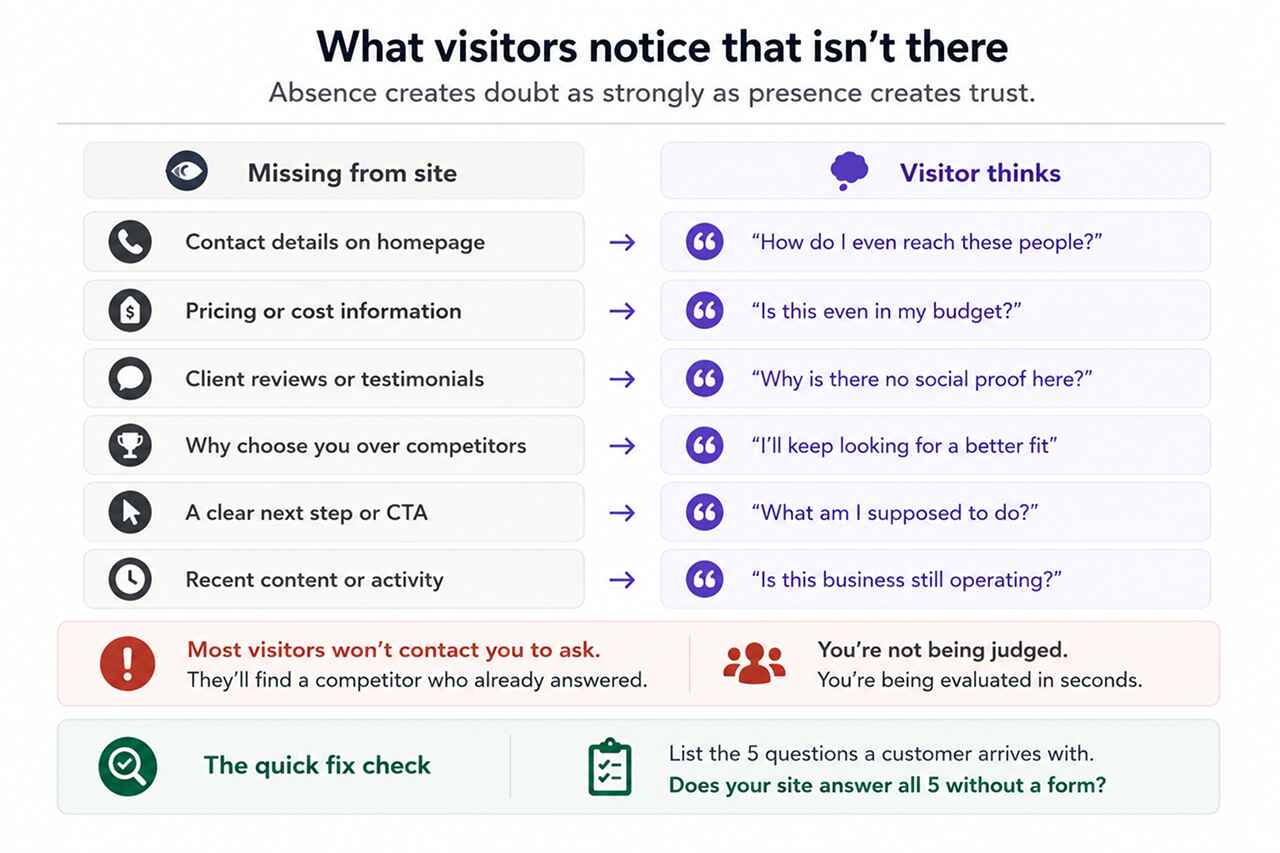
First impressions are shaped not only by what’s present on a website but by what’s conspicuously absent. Visitors who are trying to make a decision notice the gaps—and fill them with doubt.
The most damaging absences are:
- No contact details visible on the homepage or in the header
- No pricing information or even a guide to how pricing works
- No testimonials, reviews, or named client references
- No clear explanation of what makes this business different from alternatives
- No obvious next step—visitors reach the bottom of a page with nowhere useful to go
- Outdated content, events, or news sections showing dates from years ago
Businesses often assume visitors will contact them to ask for information that isn’t on the site. Most don’t. They move on to a competitor whose website already answered the question.
What to fix: List the five questions a potential customer is most likely to arrive with. Check whether your website answers all five—clearly, and without requiring a contact form submission to find out.
Those ten seconds are recoverable
The good news about first impressions is that they’re not permanent. The experience visitors have in those first ten seconds is the product of specific, identifiable decisions—about speed, clarity, design, navigation, proof, and mobile quality—and every one of them can be improved.
Businesses that consistently convert well from their websites are not necessarily the ones with the biggest budgets or the most traffic. They’re the ones that have taken the time to understand what a first-time visitor actually experiences—and addressed the gaps between what they intended to communicate and what visitors actually receive.
That gap is almost always smaller than it looks. Most websites need focused improvement in two or three areas, not a complete rebuild. The challenge is identifying the right two or three.
This is exactly where investing in professional web development services that prioritize user experience alongside technical performance tends to pay off: not in bigger visitor numbers, but in more of the visitors you already have choosing to engage.
LET'S TALK: CREATE BETTER FIRST IMPRESSIONS ONLINE
Most businesses haven’t seen their own website through a first-time visitor’s eyes for years. The familiarity that builds up over time makes it genuinely difficult to see what a stranger sees—and easy to overlook the friction points that are quietly costing you customers every day.
At Outsourced365, we help businesses identify and fix the specific points where their website loses people—across performance, design, clarity, trust, and mobile experience. Our approach combines technical analysis with real user experience evaluation, so improvements are targeted at the things that actually affect outcomes.
We can help you:
- Identify where your site is losing visitors in those critical first seconds
- Improve load speed and Core Web Vitals scores across desktop and mobile
- Sharpen your homepage messaging so visitors immediately know they’re in the right place
- Strengthen trust signals to reduce the gap between interest and enquiry
- Ensure your mobile experience matches the quality of your desktop experience
- Maintain and evolve your site as customer expectations continue to develop
If you’re not sure what your website is communicating in its first ten seconds, that uncertainty is worth resolving. Get in touch and we’ll take a look together.
Outsourced365 Services are designed to help you grow
Contact us Today!
Why Companies Build Websites with Outsourced365
With our web design services, you will get:
- Modern, conversion-focused layouts
- Responsive design across all devices
- Optimized user experience and navigation
- Scalable websites built for growth

Related Posts
See all posts